the thin green stripe: an australian flag proposal

symbolism
red ochre: the vast red sand deserts
green and yellow: the national colours (based on the golden wattle plant, the national flower)
green stripe: the small strip of arable land that most australians live on
the inspiration for the design is based on a phrase i've heard a few times throughout my life living in australia. something along the line of "most australians live on a small strip of green near the coast."
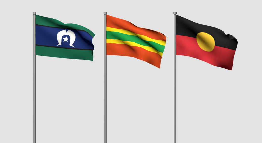
if the thin green flag replaced the national flag, this is how it would look alongside the aboriginal and the torres straight islander flags (made using flagwaver). flying all three flags alongside each other is fairly common in australia. i like that all three flags have horizontal lines, which in my opinion looks cohesive.
why redesign the australian flag?
i don't wanna go into too much detail about this cause there's plenty of info online, but basically i don't think an independent country should have the flag of another country on it. especially not the british flag jfc. if it was a good idea for canada and a bunch of other commonwealth countries to change their flags, i think it's a good idea for australia as well.
why not make a more interesting design?
most national flags are fairly simple. a lot of australian flag proposals are super complex and try to cram in as much symbolism as possible. like do we really need a kangaroo, the commonwealth star, and the southern cross? (looking at you, commonwealth kangaroo flag)
why does it have the same layout as the flag of botswana?
it's a coincidence, but a welcome one. in my experience, a lot of people interested in australian flag redesigns worry too much about making a flag that's as unique as possible. like it's some kind of sin if a flag looks too similar to another flag. personally i don't think a flag design that's unique enough that it bears resemblance to no other flags or symbols, has deep symbolism, and looks cohesive, exists. i remember a while back when i was in a facebook group for redesigning the australian flag, i posted a flag that was a yellow circle on a green background. apparently that's not a good idea because it looked too similar to the japanese flag. tell that to palau and bangladesh ^_^;
further thoughts
part of me was hesitant to post this because redesigning a country's flag could be seen as tacit approval of the country you're redesigning the flag of, or even nation states in general. i'm not like, the biggest fan of nation states, at least not how they exist in the present, but i also don't think they're going away any time soon. so if we're stuck with australia and therefore its flag for now, i don't see why we can't improve it.